10 Tips to Create a Dashboard in Salesforce

12 min
Salesforce has many benefits. Complete customer information and history from related objects. Real-time accuracy for all users upon updates. Advanced, tiered data security based on users, roles, profiles, and many other factors. Automated processes for any number of manual tasks now. Einstein Analytics and other tools to identify optimum ways of operating.
These features help managers and users alike in performing the job more efficiently and with greater business intelligence. However, there is one tool that ties everything else together.
The Dashboard
Nothing else pulls together the hard work that our teams do with the slick features of the system quite like dashboards do. With so many aspects to go into creating one, this article cover some tips to building an incredible dashboard that exemplifies the team’s successes, identifies opportunities for improvement, and keeps leaders and users current with the most important information.
1. Components
Let’s start with the playing field. The Dashboard starts out as an empty grid which allows you to individually add reports. To add a report, start by clicking the “+ Component” button. Then select the report you’d like to use. There are a few more steps detailed below before we get to sizing, and we’ll cover those in the appropriate section. Once the report is selected, we can resize and shape it however we’d like within the grid.
The default width is 12 columns wide, although there is also an option to select 9 columns wide. Both options expand to the full screen, so the only difference between the two is how the area is divided up. The default option comes with 12 skinnier columns. As you add components to the grid, you do not have to fill all the way across. However, as a tip it’s recommended that you do fill all the way across. The dashboard can be viewed easily when viewing from the dashboard tab. However, if you add the dashboard to Lightning Home Page, the larger the better. Leaving excess empty columns (or other sections of the grid) makes it a little more difficult to see the dashboard contents. Also, it is not very satisfying to look at.
2. Chart Types
There are numerous different ways to graphically display data, and knowing the different options is a great start.

Horizontal Bar Chart and Vertical Bar Charts – simple bar graph plotted with an X and Y axis. While they don’t have to be ordered in any particular way, the Horizontal Bar Chart looks best ordered from top to bottom, almost giving the appearance of a race to the finish line. The vertical version – probably the most traditional chart in Salesforce or any other system – is a tried and true staple for organizing data in a way that is easy to digest. Both charts can use multiple groupings. Also both can display up to four measures (with the same unit of measure). You can add a secondary unit of measure on the Y-axis for additional detail.

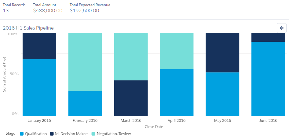
Stacked Horizontal and Vertical Bar Charts – similar to the unstacked versions above. If there is a single measure and single grouping, these will actually end up looking identical. However, when adding a secondary group to the “stacked” version of the bar chart, these are a great representation of data broken down into multiple subcategories. For example, if you want to break down cases by priority by category, the chart on the left is a perfect option. In this scenario, we can see the comparison of total cases by category with additional detail broken down by priority within the bar.
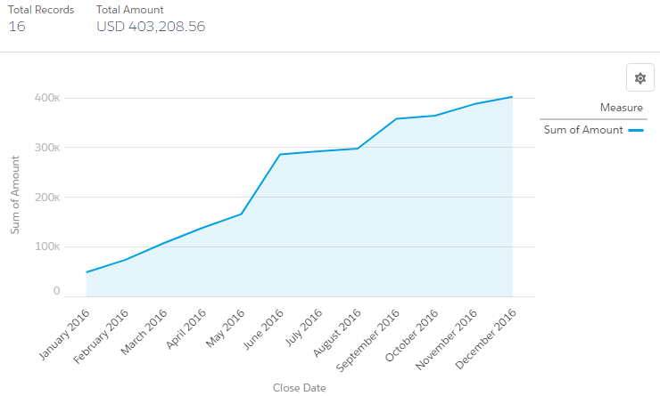
Line Chart – the line chart uses a continuous line to follow values. This chart is ideal especially for tracking several values over time, establishing a trend. Tip – use this chart in conjunction with a bar chart to get both specific value month by month as well as trends over time.
![The Donut chart - Salesforce Lightning Reporting and Dashboards [Book]](https://cdn.prod.website-files.com/5ebc4dae09fa971fce3e85a5/610c38efd5f573cbff60fd10_xIateg08NbXszqPyca7p2ciGuBqJBgkCLVLtJDQ5Fg30gYMpDj0tF9SiABOL2OwCRNtOLuoiDZ5Ra2VV9wHx2kUzDPVI1R_zrYo8PCPnNhZIDLJ1Wbpaok8igfe65OiERFS9NTc.png)

Donut Chart and Funnel Chart – functionally, these two charts provide the same data and subcategory breakdown. Much like the stacked bar charts, these gives a total value as well as a breakdown by subcategory. There is a similar use case as the stacked bar chart, however use this for a period total and the stacked bar chart for an additional breakdown. For example, use stacked bar chart to breakdown revenue by lead source by month, and the donut or funnel chart to breakdown revenue by lead source for the whole year.

Metric Chart – the simplest of charts. A single number. Still very useful. Every company, department, team, and individual have KPI’s and often there are one or two that are the most important numbers. Tip – use the Metric Chart to display that most important team or department KPI and display it prominently at the top. Tip – don’t overuse the Metric Chart. Some admins fill up a whole dashboard with Metric Chart numbers. That is a report, not a dashboard.
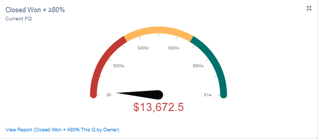
Gauge – much like the Metric Chart, this is a simple chart with a single number. However, the arched axis gives a nice visual of where the team stands against a goal. By setting benchmarks of where the Gauge turns from Red to Yellow to Green, our natural instinct is to keep pushing to get the dial pointing in the right direction.
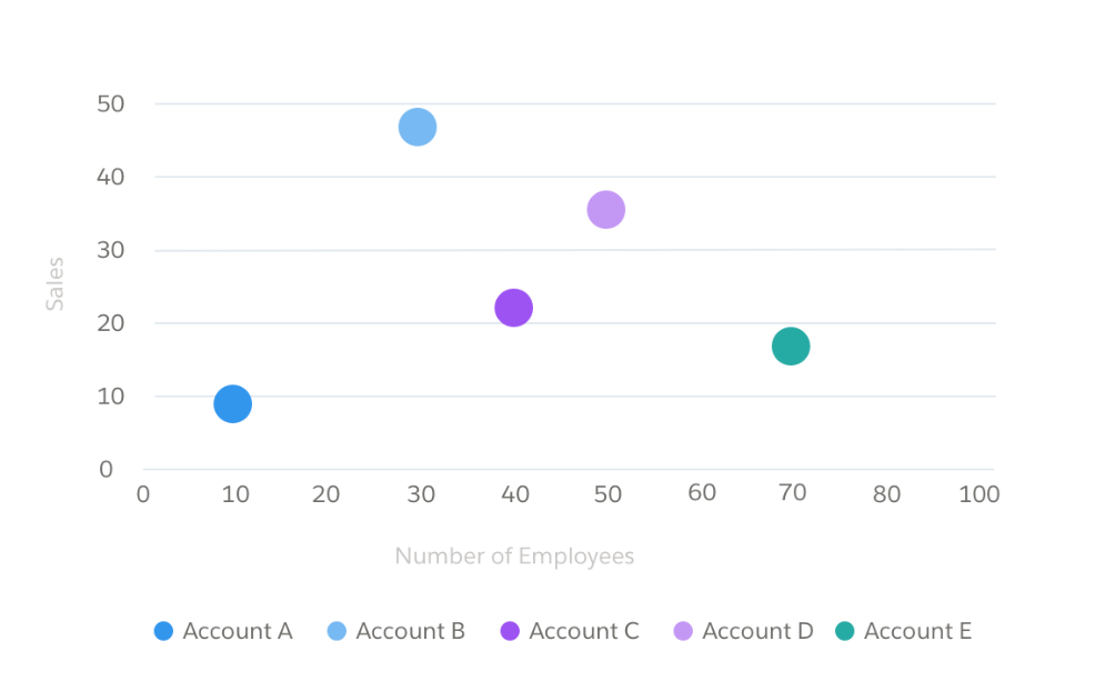
Scatter Chart – this chart gives a specific point for each piece of data in the report. For most sales and service-related functions, this report is not that useful. However, for many other operational and business-specific situations, this can be very helpful. Tip – use this chart to identify trends and outliers, especially when the trend is not easily recognizable while looking at the base report. Tip – plot similar reports next to each other when numbers are unexplainably out of kilter. For example, operations were normal in May and June, but strange in July. Use three separate Scatter Chart displaying numbers for each month next to each other and see if the data gives outliers or trends that help identify the issue.
Lightning Table – earlier in this section, I joked not to use a report on a dashboard. Well, this is a report. In actuality there are times when raw data provides added detail to nice, summarized charts. Tip – use this to display key lists, such as “Top Accounts”, “Priority Service Issues”, “Next Week’s Closings”, etc. But still don’t fill a dashboard with Metric Charts.
3. X and Y Axis
The options for the axis will vary based on the report type. For reports that have groupings, you can use this to create groupings within the X and Y axis. For best results, try to use measures that have the same unit of measure. Tip – compare measures where the results are within an order of magnitude. In other words, charts would not be useful to compare a result in the thousands with one in the millions, since one measure would be large and the smaller measure would be unrecognizably small.
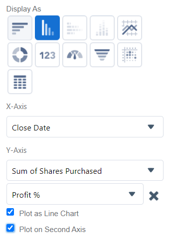
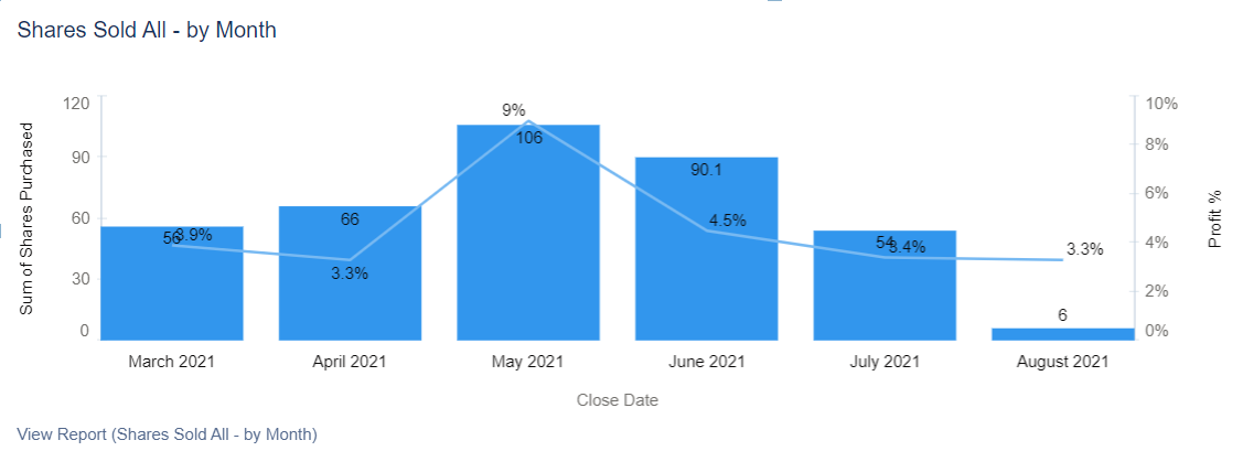
Keep in mind you can add a secondary access in certain circumstances so that the Y-Axis on the left side (primary) is displaying different units than the Y-Axis on the right side (secondary). Also – it is possible to utilize a line chart on top of a bar chart when comparing different measures. Using the selections above, you will get the chart below, with a total number displayed as the primary axis unit of measure and a percentage as the secondary. This also plots the first measure as a bar graph with the secondary measure as a line chart.
4. Display Units
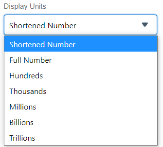
Display units are pretty simple. Pick the best number for the look and feel of the chart. Shortened numbers are a good default choice. The display unit selection just prevents the chart from being overrun with a bunch of trailing zeroes.
5. Title Subtitle Footer
Don’t forget to label your chart. The default title of the chart on the dashboard will be the actual name of the report that is the basis for the data. You can change it. Tip – you can use the same report to generate different bits of data. For example, you may want to show a KPI as a Metric Chart, but also provide a detailed breakdown as well. Input the same chart with two different chart types and other details. This is a good example of using a different title to differentiate the two.
Subtitles and footers are great for providing additional detail. Keep in mind that while you may know exactly what the report or dashboard is for, it is helpful to other users to spell it out for them. If someone viewing the chart were to ask, “what am I looking at?” The Title, Subtitle, and Footer should clearly answer the question.
6. View Dashboard As
One of the most powerful tools within the dashboard is the “View Dashboard As'' function. This can be found in the Properties gearbox in the upper right corner of the dashboard edit display. Run the report as “me”. That means that the report will always be viewed as you (i.e. the person who made it).
The dashboard can also be viewed as another specific person. This is useful if the dashboard needs to be shared with individuals outside of a team, but who need to see that team’s results.
Next, we can view it as the “dashboard viewer”. This means that whoever is viewing the dashboard will see it from their own perspective, and make it a “Dynamic Dashboard”. This is important when using reports based on “my” records rather than full team or full org data. Tip – use reports filtered on “my” records before using dashboard filters. It is easier to maintain.
Last – we can let the user determine who to set for the dashboard “view as”. This can be useful for larger organizations who need to see other team’s views. Theoretically, this could also be used in place of filtering the report by user. In this scenario, using filters is recommended over letting users pick their view as an option.
7. Themes and Palettes
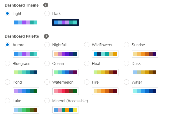
Salesforce comes inherently with various color schemes to make your dashboard pop. As you utilize different groupings and display different measures, the items will naturally default to the selected color scheme. Light versus Dark just determines if the background surrounding the chart data is white or dark (navy blue).
8. Filters
This is a powerful tool that allows the user to toggle between different sets of data. For example, let’s say the dashboard has various different reports based on year-to-data data. Add a filter for Close Date Month or Created Date Month, which allows the dashboard user to break down the report into an individual month. This can also be done with users. For example, add a filter for opportunity or case owner to see reports based on a single person or multiple users comprising a subsection of the total dashboard. Tip – add up to three filters. In the example above, you can look at year-to-date data, but filter it down by month and by owner to get granular information.
Reports have the ability to use buckets on certain fields, to artificially lump data together into groups (buckets). While reports with bucketed values can be used in the dashboard, we can’t filter on bucketed fields. However, you can filter on the original field that the bucket is based on.
9. Follow, Favorite, and Subscribe
No. This is not an invitation to keep up with my YouTube channel. Use the follow button to keep track of updates via chatter and to keep the dashboard front and center. For organizations with several reports and dashboards, the option to “favorite” it will save the report/dashboard in a special folder of “All Favorites” for easy reference later on. Lastly, the subscribe option will email the report daily, weekly, or monthly. Specify days, dates, relative days, and/or times to receive the subscription. Tip – teach old dogs a new trick. For those who are slow to embrace Salesforce and love excel and other things emailed to them, subscriptions are perfect to get them used to receiving data in this format. Also, it provide a quick link back to the system which will encourage them to work within Salesforce instead of outside.
10. Dashboard/Report Limits
There are many system limitations on Dashboards and Reports as there is for every object.
- Just a view of key limitations to be aware of.
- Custom Report Types (50 for professional, 2000 for Unlimited/Performance)
- Dashboard Filters (3 for all)
- Dynamic Dashboards – None for Profession, 5 for enterprise, 10 for Unlimited/Performance
- Field Filters – 20 per report
- Formulas per Report – 5
- Dashboard filter – up to 50 values
- Dashboard – 20 components
- Dashboard – up to 20 photos


