Understanding Salesforce Report Formats: Tabular, Matrix, Summary and Joined

10 min
When a company considers moving to Salesforce, they visualize what the business will look like operating on the world’s most popular CRM solution. It’s difficult to picture object structure and relationship, process automation design, templates, and security setting. Reports and dashboards, on the other hand, deliver a perfect visual representation of functional, successful, and real-time organization. Leaders and end users at all levels look for reports to deliver vital, timely, and actionable information to them. Every updated record instantaneously keeps the organization up-to-date and provides confidence that they have control of their business.
Needless to say . . . as admins we need to have a mastery of building great reports.
This article focuses on understanding the different report formats: Tabular, Summary, Matrix, and Joined.
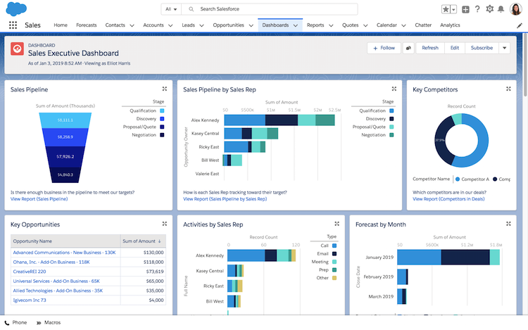
Quick Overview
What is the difference between a Tabular, Summary, Matrix, and Joined report in Salesforce. Let’s start by differentiating “report formats” from the terminology “report type”. In Salesforce parlance, report type specifically refers to the objects involved in the report and which fields are available to use. For example, a report type of “Accounts with Opportunities” would be a report that pulls in data from Accounts that have at least one Opportunity associated with them. Admins can define which fields are available, including all fields from the Account and Opportunity objects, as well as other look-up objects (for example you can pull in fields from Contacts, too). The “Accounts with Opportunities” report type can then be structured into any of the four formats. Let’s take a quick overview of each one:
Tabular – this is similar to basic spreadsheet. Each row is one record, with numerous columns of data that comes from that record. The complete list can be total at the bottom by record count or any other summarizable value.
Summary – similar to Tabular reports, Summary reports include rows of data where each row equates to one record and fields from the record populate each column in the corresponding row. However, Summary includes a group or multiple groups as well. This enables the report to subtotal data into groups and subgroups, up to four levels down.
Matrix – this report has groupings by both rows and columns. The underlying data still starts with one record for each row, and viewing the report with details isn’t very useful (or easy to read). With detail rows turned off, the report provides subtotals with each combination of rows and columns.
Joined – joined reports combine two different reports into one. The two reports must have one common element. For example, a bank may have Customers with Bank Accounts as well as Customers with Insurance Policies. Even though the Bank Accounts and Insurance Policies may not be related, they can be joined since they have Customers in common. The joined report will display side by side, using records from the common object as the rows. So in this scenario, Customers would be the rows with a series of Bank Account columns followed by Insurance Policy columns for the same Customer. There can be up to five “blocks” in the Joined report, and the report can be Tabular, Summary, or Matrix (each block will be the same format).
Building a Report
As we build reports, there are a few factors to make the perfect report, and the formats above are just one of them. Understanding the components that make up a report is critical to ensuring the correct data is pulled in and displayed in the right way. Here are the steps to building the perfect report.
Report Type
As mentioned above, the report type starts by defining the objects that will be the source of records for the report data. A report can simply be one object – a standard object like Opportunities or Accounts. Or it could be a custom object, like Projects, Insurance Policies, or Bank Accounts. The report will then be based on records from the object.
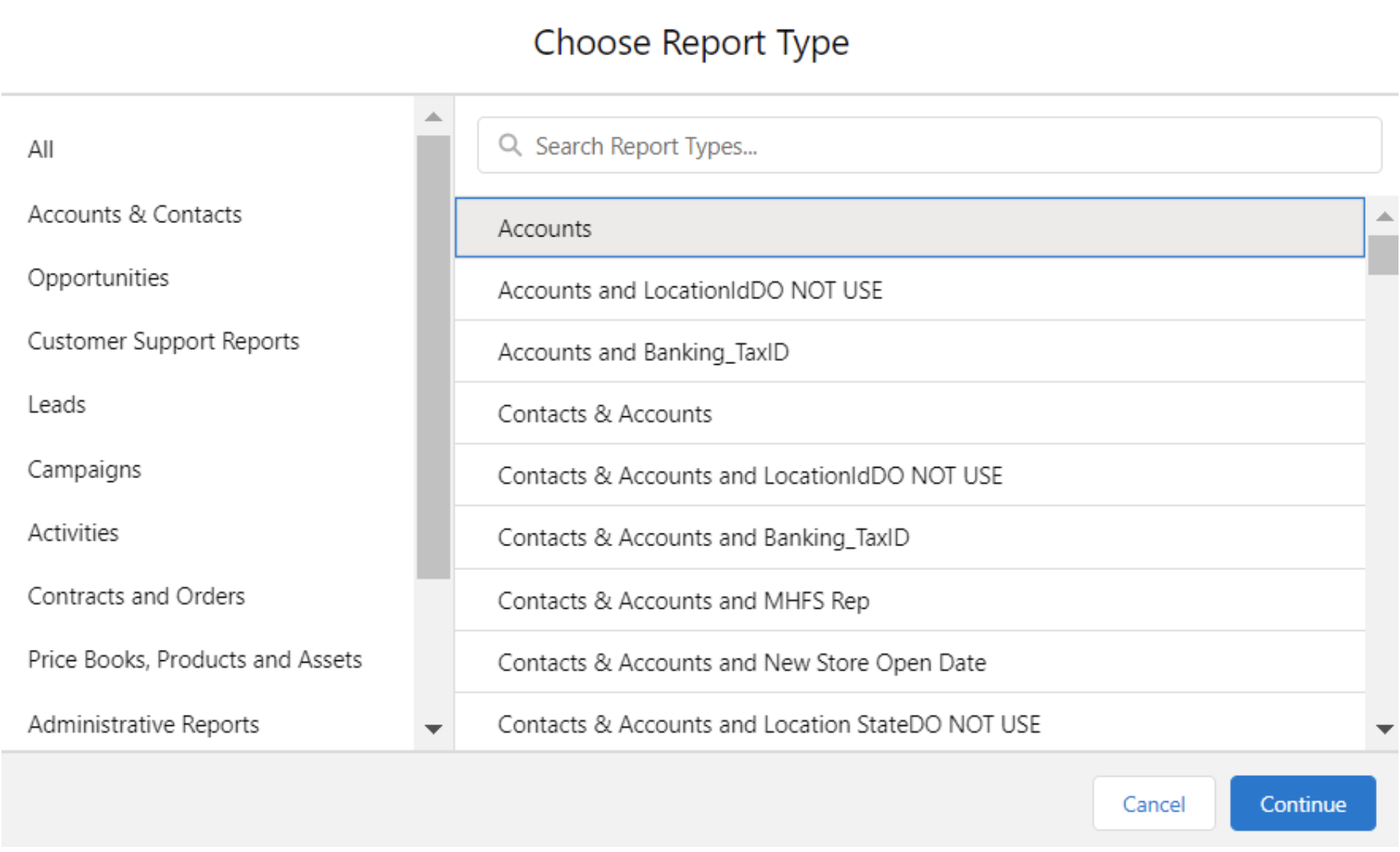
Reports can be built on multiple reports as well. For example, Accounts with Opportunities will report off of all Accounts that have at least one Opportunity associated with them. The negative can be true as well. The report type of “Accounts without Opportunities” only shows reporting data for Accounts that don’t have Opportunities. The combination can include up to four objects. It essentially works like a Venn diagram. “Accounts with Opportunities and Contacts and Cases” would include the Accounts that have all three. So an account with a Contact and Case, but no Opportunity would be omitted.
After establishing which objects to include and exclude, we have the option to determine which fields are available. By default, the report type will have all of the fields on these objects. However, we can add associated fields from related records as well. The Owner fields on the Case object could be pulled in as well. This is especially useful for filtering.
Report Format
After selecting a Report Type, then we can establish the Format out of the options described above. Tabular will be a basic spreadsheet, with no groupings of rows or columns. Summary will group the rows together into subtotals (again up to four levels deep). Matrix will group by both rows and columns. Joined combines multiple Reports together, as long as they have a common object.
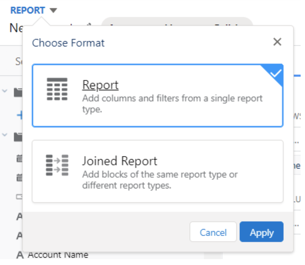
In Classic, the Report Format is selected from a dropdown picklist. However, Lightning is just drag and drop. The default format is Tabular. However, making it into a Summary Report is as easy as dragging a grouping into the “Group Rows” section. Once we drop one (or two or three or four) fields in there, we have a Summary Report. You’ll notice that the “Group Columns” option doesn’t appear until after there is at least one field in the Group Rows section. When it does appear, its also just drag and drop to convert the report from Summary to Matrix.
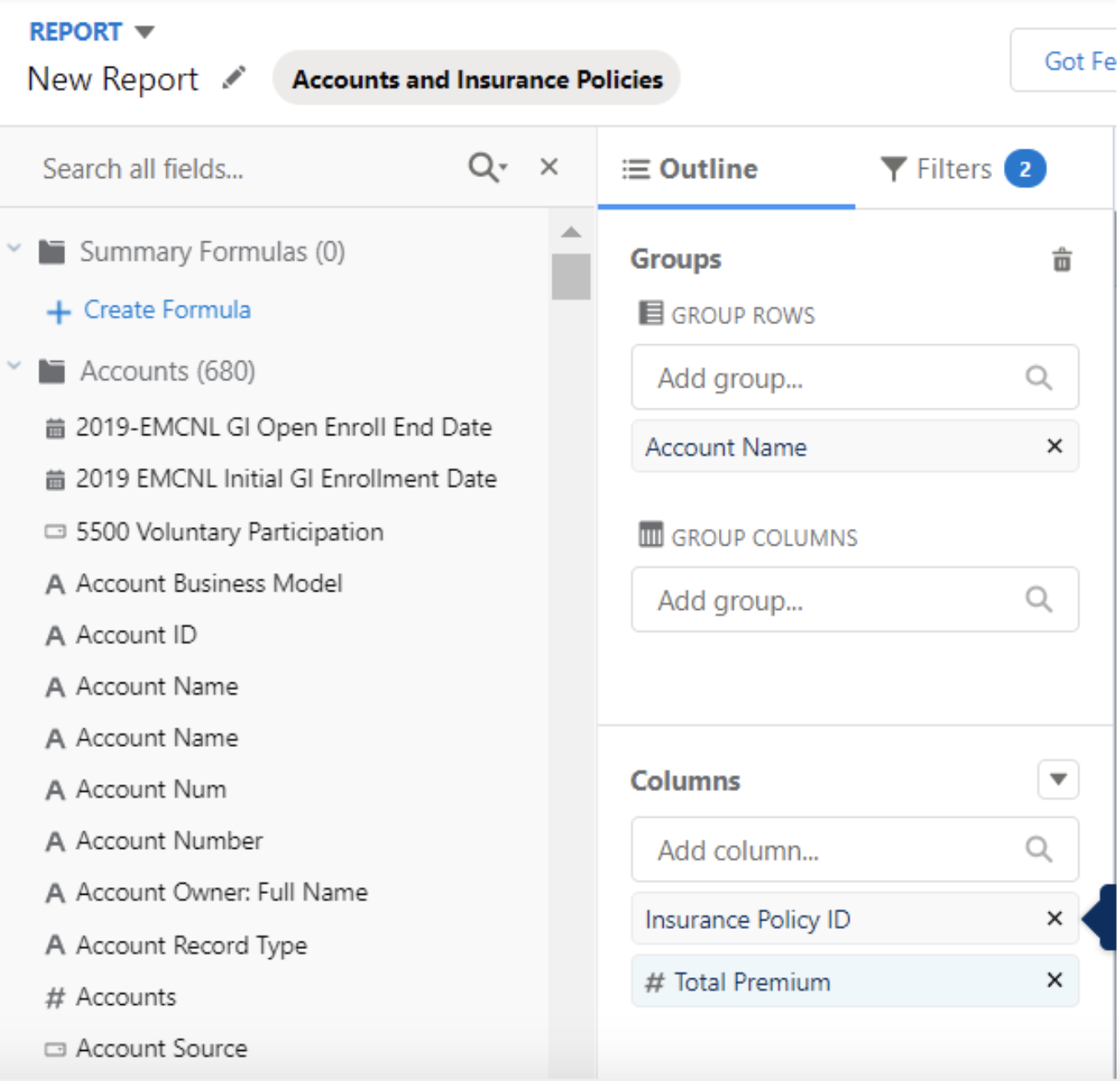
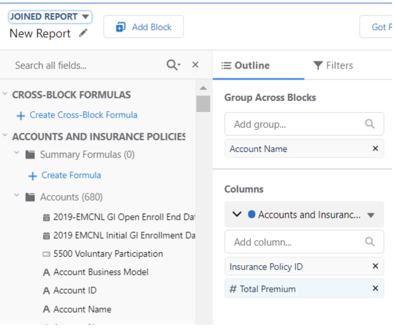
Joined Reports work a little bit differently. In the upper right corner of the Report Builder screen, there is a drop down to change from a regular report to a Joined one. Once that has been selected, we have the option to add “blocks”. The first block by default is the Report Type that we started with. Let’s say that we created a report called Accounts with Bank Accounts. Once we change that to a Joined Report, Block #1 will be “Accounts with Bank Accounts”. Then we can add Block #2. In this case, let’s say this block is a report type of “Accounts with Insurance Policies”. (Remember – each block of a Joined Report has to have one object in common – in this example that is Account)
Report Components
In addition to Row and Column Groupings, we have a few other components to the report. Of course, we want to establish what information is displayed for each row. In the “Columns” section of the report, we can add in up to 100 columns (please don’t add 100 columns)! The columns will display the field information for the corresponding record in each row.
Next we will utilize the Filters tab to narrow down records that we include on the report. Two filters are always required. Ownership and Date Range. Ownership can be anything from “All Accounts” to “My Accounts” or other groupings like My Team or the User. The Date can be filtered from any date field available on the record, like Created Date, Close Date, Last Updated Date, or many others. For dates, we can filter to say “All Time”, set a specific range, or use relative values like “Last Month”, “This Year”, or “Today”. After establishing these two mandatory filters, we can add as many other filters as necessary.
- For example, I might have an Opportunity report with the following filters:
- My Opportunities
- Created “This Year”
- Amount Greater Than $1,000,000
- Stage = Quote or Negotiating
This would nicely narrow down the report to exclude other people’s opportunities, as well as older ones. The opportunities for this report would only be the big ones that were still in the pipeline.
Putting this all together, each row equals one record. The information/fields from the record will be displayed across in the columns that we established. We can subtotal the rows into groups, and we can further summarize it by columns if we want. Lastly, we can use filters so the report only captures the subsection of records we want.
Charts and Display
Going into detail on Charts could be a lengthy article on its own, so suffice to say that there are a myriad of options to spice up the report with a great looking chart. As an FYI the chart can be associated directly with the report, or designed as part of a dashboard. When it comes to getting the most of our of the Report Formats discussed in this article, the last step is to make use of the radio buttons at the bottom. Tabular Reports are pretty basic so there’s not much value in hiding anything with the radio buttons.
However, the Detail Rows can be toggled on and off for Summary and Matrix in useful ways. To get higher level subtotals on a Summary report, turn Detail Rows off. This will consolidate totals down for the Row Groupings. Flip the Detail Rows back on to get specific records. The Matrix works in a similar way – with Detail Rows off the report makes a nice grid displaying summary totals of the different Row-Column combinations. Turning Detail Rows back on for a matrix still gives those individual records down below.
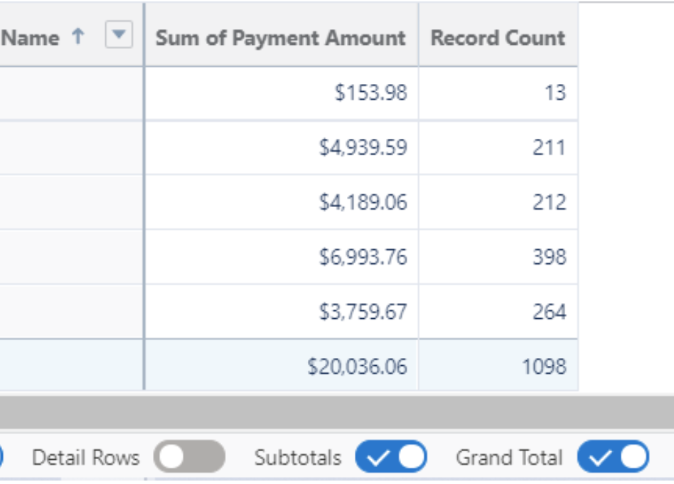
As mentioned above, Joined Reports can be Grouped into Summaries or Matrices, or just left as raw data on a Tabular report. The Detail Rows toggle is available there too, which can be especially useful for Joined Reports since they tend to get pretty busy with several columns.


